June 11, 2026
5 Reasons Visitors Leave Your Site Without Contacting You
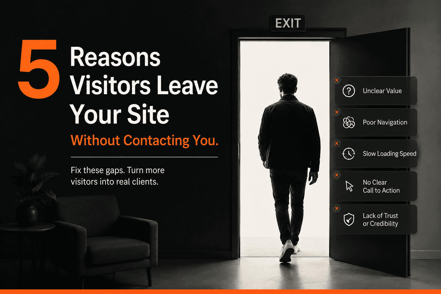
You redesigned your website eighteen months ago. It looks fine. Maybe better than fine — you paid real money for it. And yet the phone doesn’t ring any more often than it did before, and the contact form sits mostly empty.
If that sounds familiar, you’re not alone, and it’s not because your business isn’t good enough. It’s because most business websites are built to look good in a portfolio, not to do the one job that actually matters: turning a stranger into an enquiry.
Here’s what’s usually going wrong, and what actually moves the needle.
1. Your site loads too slowly to keep anyone around
Every extra second a page takes to load costs you visitors — and it compounds. A site that loads in 5 seconds instead of 2 can lose over a third of its visitors before the page even finishes rendering. Most business owners never see this happen; the visitor is just gone, no error message, no explanation.
Speed isn’t a “nice to have” add-on. It’s the first filter every visitor passes through before they ever read your headline.
2. There’s no clear next step
Open your homepage right now and ask: if a stranger landed here for the first time, would they know exactly what to do next? Not eventually — in the next five seconds.
Most sites bury the call to action under three paragraphs of “About Us” copy, or scatter five different buttons that all say something slightly different (“Learn More,” “Get Started,” “Contact,” “Book Now”). Confused visitors don’t take a chance on picking the right one. They leave.
A site built to generate leads has one obvious next step, repeated consistently, above the fold and throughout the page.
3. It talks about you instead of the visitor’s problem
Most “About Us” style websites open with the business’s story: how long they’ve been around, their mission, their team. That’s a page two story, not a page one story.
Visitors don’t arrive asking “who are you?” They arrive asking “can you solve my problem?” The websites that convert lead with the visitor’s pain point — slow service, outdated look, poor Google visibility, whatever it is — and only introduce the company once that connection is made.
4. Google can’t find it
A beautifully designed site that ranks on page three of Google is invisible to the people searching for exactly what you offer. Poor technical SEO — missing meta descriptions, unoptimized images, no clear page structure, slow load times (see #1) — quietly caps how much traffic a site can ever receive, no matter how good the design is.
Design and SEO aren’t separate projects. A site that isn’t built with search in mind from day one is starting every campaign at a disadvantage.
5. It was designed once and never touched again
The businesses seeing consistent growth from their websites treat them as living systems, not one-time projects. They review what’s working, test different headlines and calls to action, and make small improvements monthly based on real visitor behavior — not gut feeling.
A site that hasn’t changed since launch is a site that’s guessing.
What this actually means for you
None of this requires starting over. In most cases, it means auditing what’s already there: where visitors are dropping off, what’s slowing the site down, and where the message and the call to action are misaligned. Small, targeted fixes — a faster host, a clearer hero section, one consistent call to action — often move the needle more than a full redesign would.
If you’re not sure which of these five is actually costing you leads, that’s exactly what a website audit is for. We’ll show you specifically what’s holding your site back, not a generic checklist.