Casa Lumen
Client
Casa Lumen
Category
Luxury Villa
Timeline
11 Days
Services
Web Design
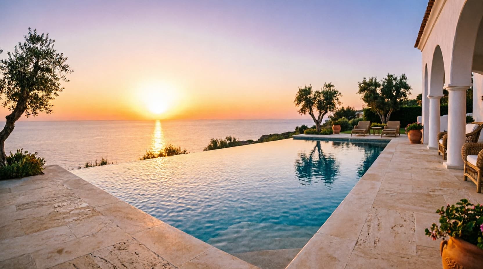
Casa Lumen's owners were letting the villa privately, relying entirely on WhatsApp forwards of phone photos and a broker's word. They didn't want a typical listing site with a hundred thumbnails and a booking calendar — they wanted something that would filter enquiries, not invite a flood of them. “If it feels like Airbnb, we've done it wrong.”
Three decisions that shaped the site.
Restraint as the luxury signal
A warm stone-and-brass palette, true-color photography with no graphic filter, and a wide-tracked serif — deliberately calmer than a typical high-end web build, because a private villa listing needed to read expensive through absence, not flash.
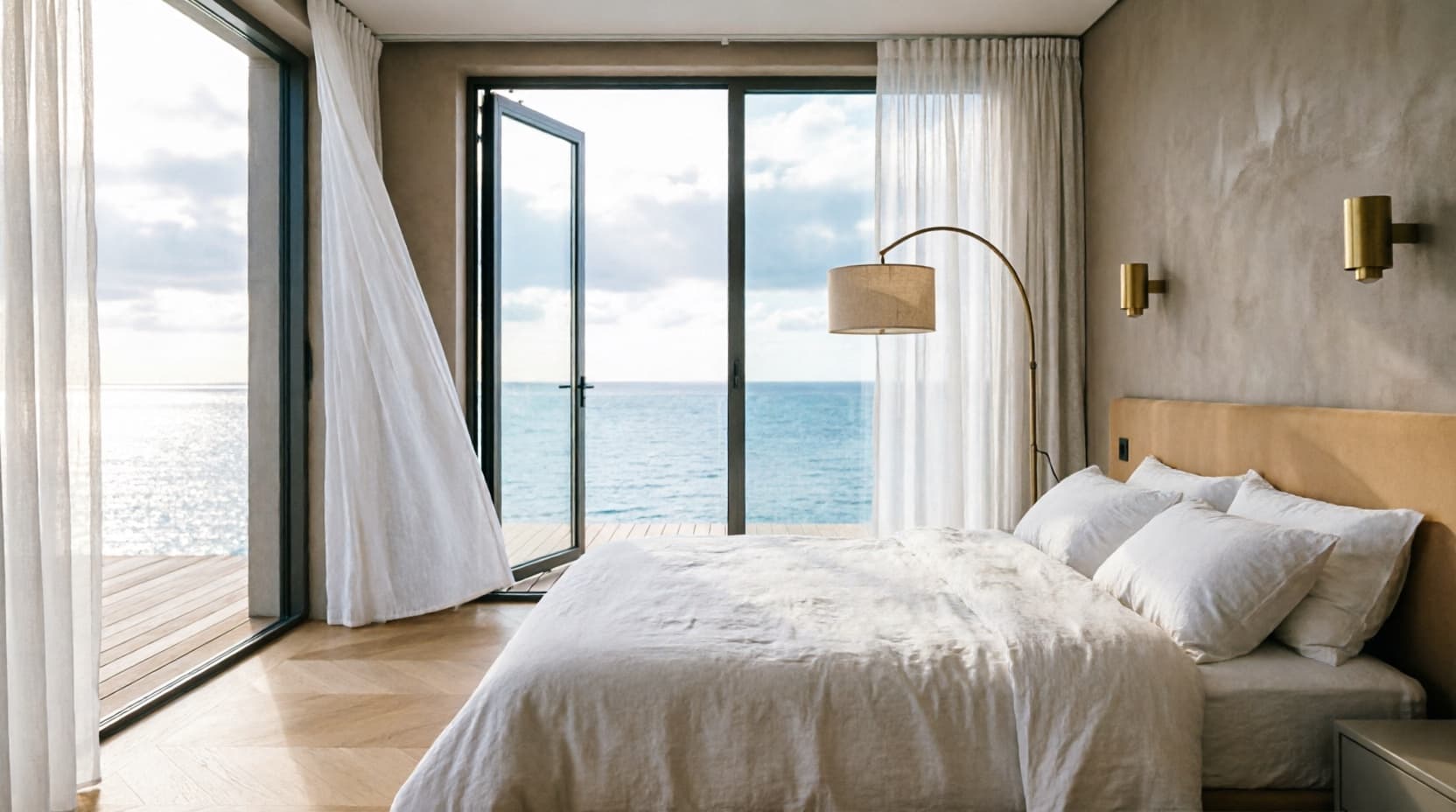
An editorial spread, not a gallery grid
The gallery runs as an asymmetric full-width and split rhythm, closer to a print real estate feature than a scrollable thumbnail wall — because the photography deserved room to breathe, not a grid competing for attention.
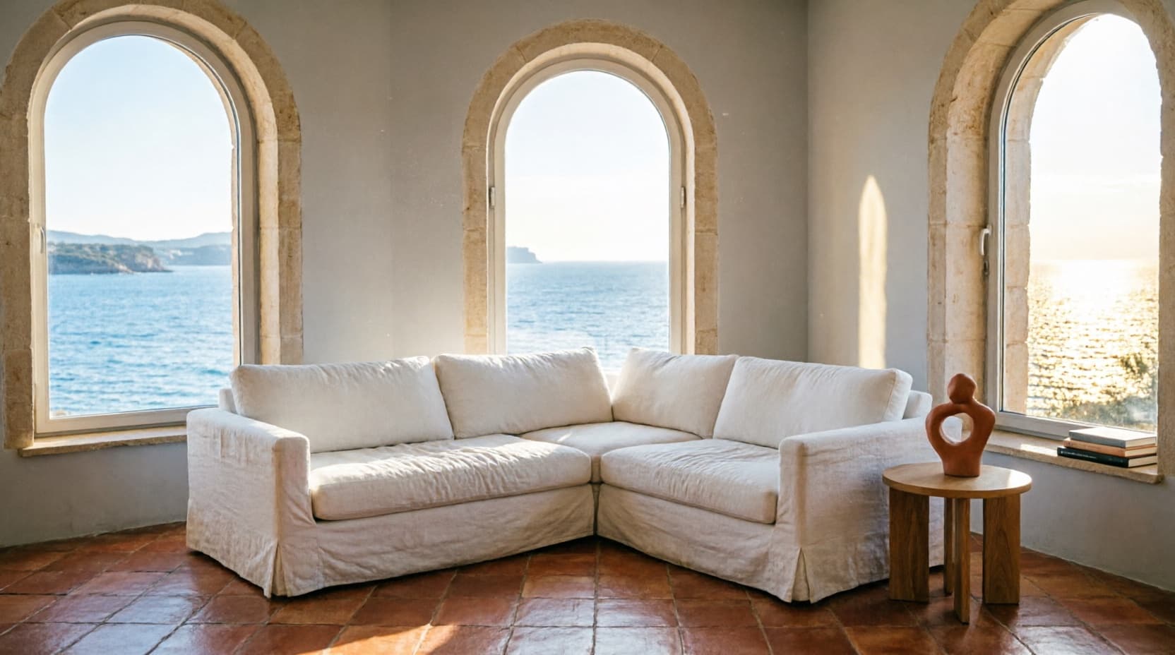
By appointment only
'Private viewings,' not 'book now.' The enquiry form and copy throughout frame the process as selective, matching how the property is actually shown — one party at a time, not an open house.
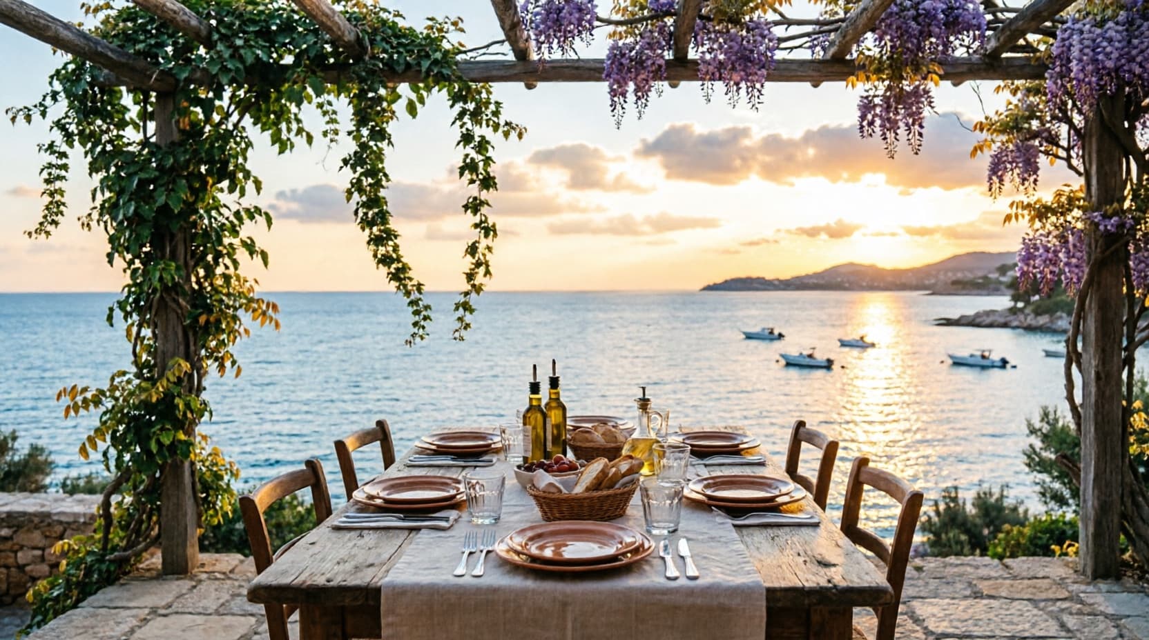
Brief to launch.
11 Days
Start to launch
Days 1–2
Discovery
Reviewed the owners' existing phone photography and verbal pitch to identify the four things that actually sell the villa — privacy, the pool, the light, the staff.
Days 3–5
Design System
Built the stone-and-brass palette and the editorial gallery rhythm the rest of the site would run on.
Days 6–9
Build
Built the spec sheet, gallery spread, amenities list, location band and the private-viewing enquiry form.
Days 10–11
Review & Launch
One round of revisions with the owners, launched privately to their existing broker network.
What the site actually did.
Shared privately with the owners' existing broker network — no public listing, no paid promotion.
Qualified viewing requests, first month
Of visitors scrolled past the gallery
Average time on site
Brief to launch
How the site actually reads, top to bottom.
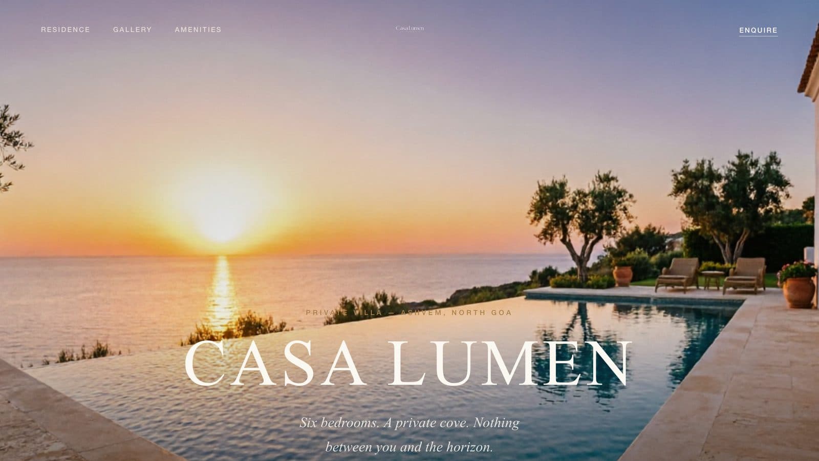
Hero
A warm stone-and-brass palette and true-color photography with no graphic filter — deliberately calmer than a typical high-end web build.
Reads expensive through restraint, matching how the villa is actually shown: one party at a time, not an open house.
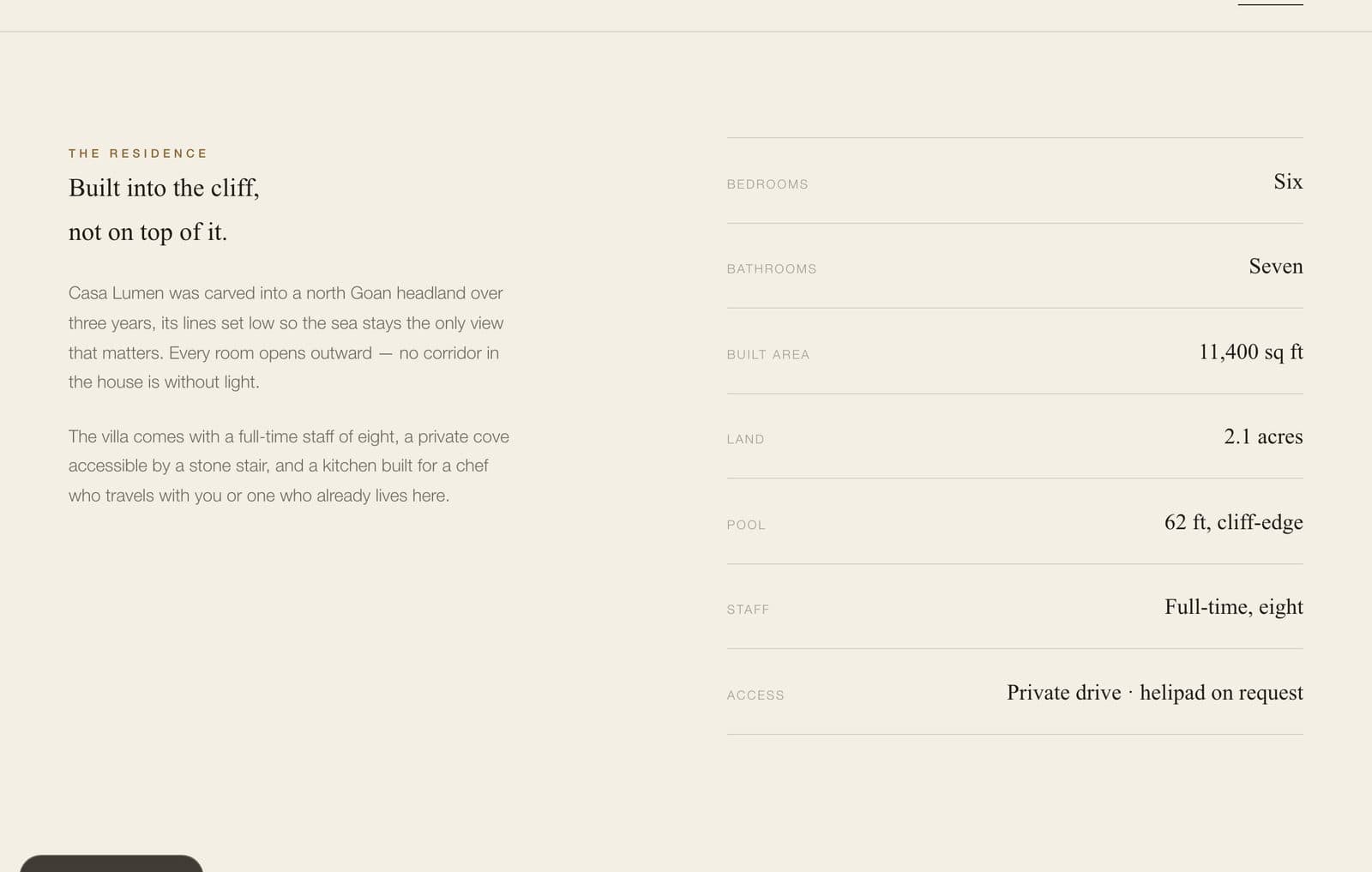
The Residence
A structured spec sheet standing in for what a broker used to explain verbally over WhatsApp.
Gives serious enquirers the facts up front, without needing a call first.
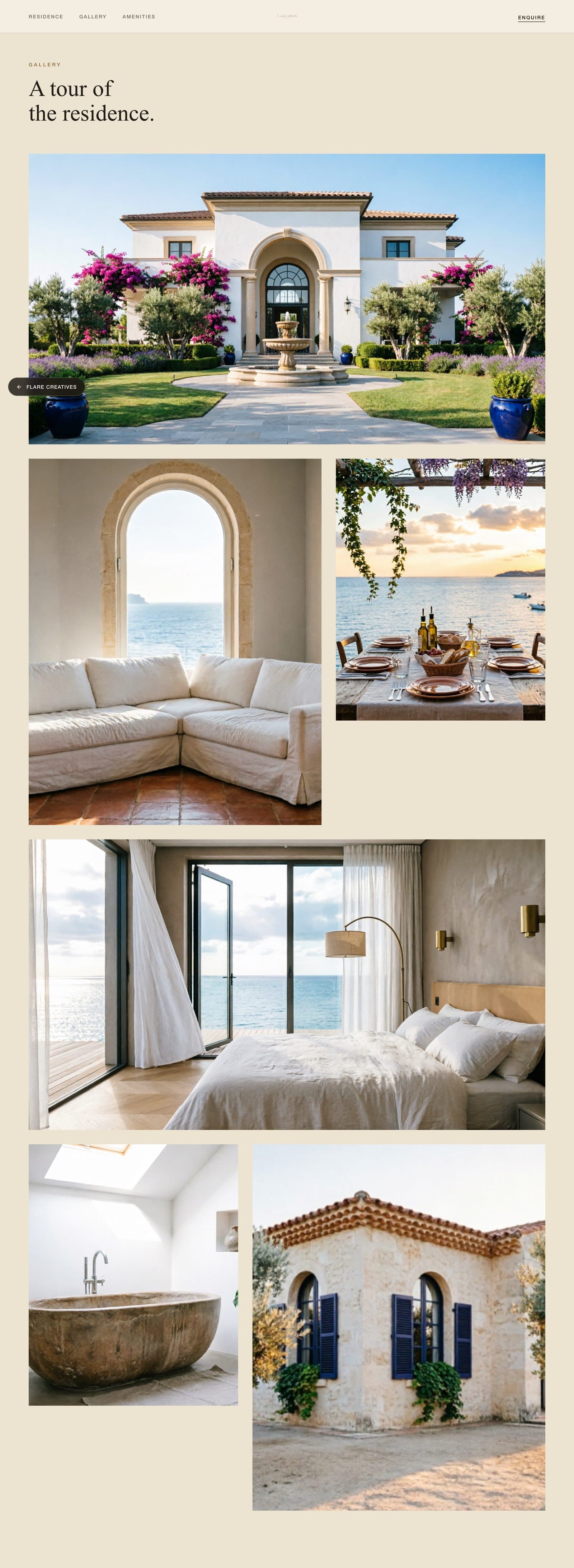
Gallery
An asymmetric, full-width and split gallery rhythm, closer to a print real estate feature than a scrollable thumbnail wall.
73% of visitors scrolled past the gallery — the photography is holding attention, not being skipped.
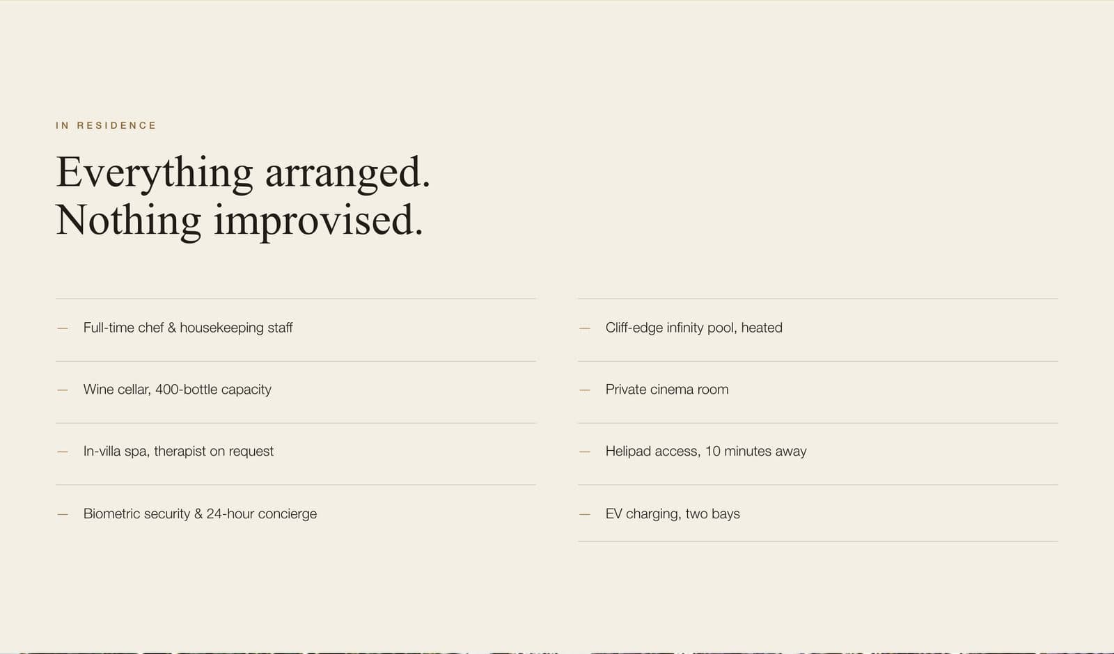
Amenities
Amenities and location presented as fact bands rather than icon grids, matching the restrained tone of the rest of the site.
Supports the villa's private-viewing positioning through to the enquiry form.
The systems behind the site.
Private-viewing enquiry system
Built to filter serious enquiries rather than invite an open flood — replacing WhatsApp forwards of phone photos.
Property spec sheet
A structured spec and amenities section standing in for what a broker used to explain verbally.
Editorial gallery system
An asymmetric, full-width gallery rhythm — 73% of visitors scrolled past it, engaging with the property in depth.