Studio Form
Client
Studio Form
Category
Interior Design
Timeline
10 Days
Services
Web Design
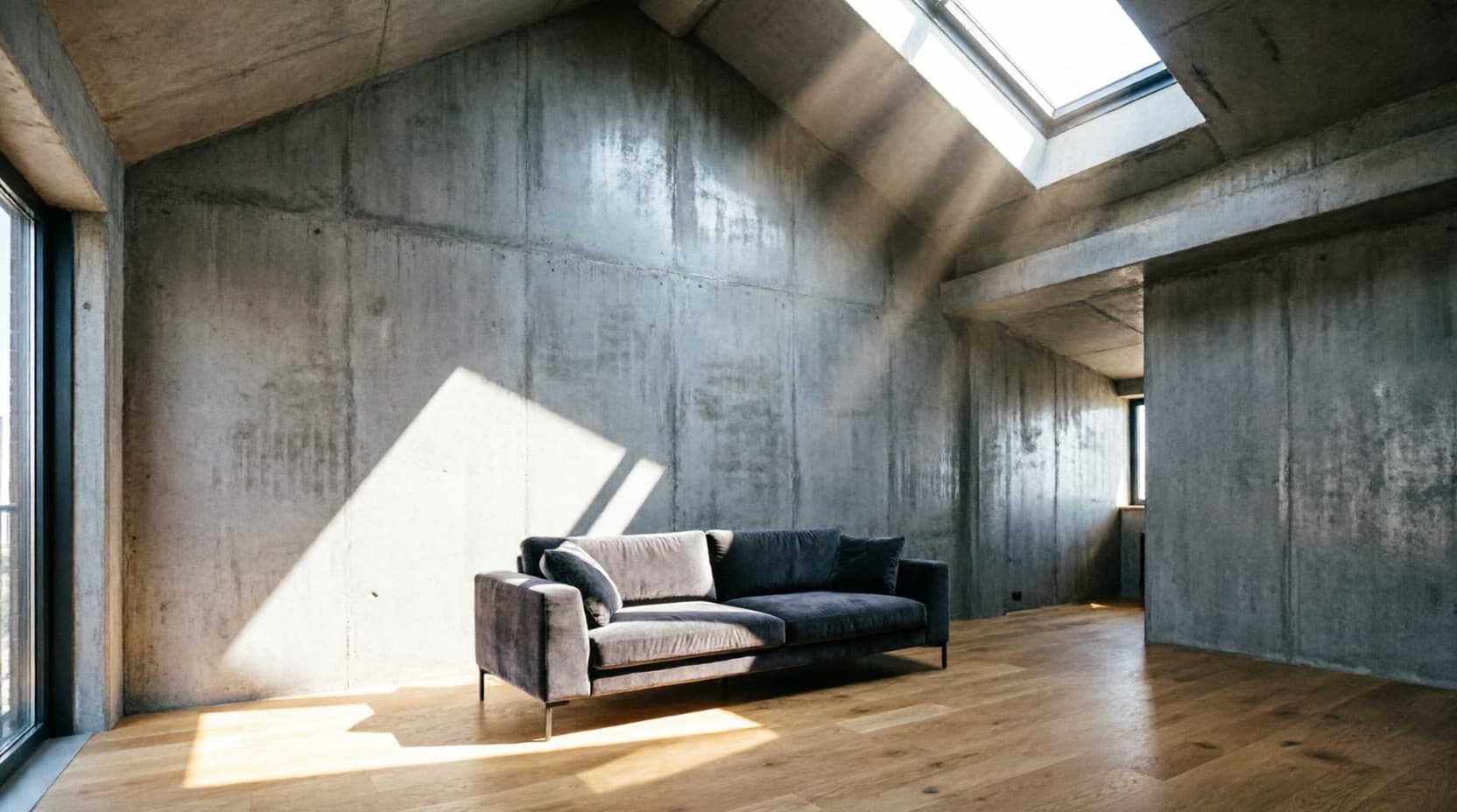
Studio Form had the projects and the eye, but their entire portfolio lived in a PDF deck resent for every new enquiry — no site, no way for a prospective client to just browse. They didn't need a rebrand; their existing name and mark worked fine. They needed a home for the work that felt as considered as the rooms themselves. “stop making us email a PDF like it's 2015.”
Three decisions that shaped the site.
An asymmetric grid, not a slideshow
The project index runs as a masonry-style grid — tall, wide and square frames mixed deliberately — instead of a uniform slideshow. It's closer to how the studio actually pins up a mood board than a standard portfolio template.
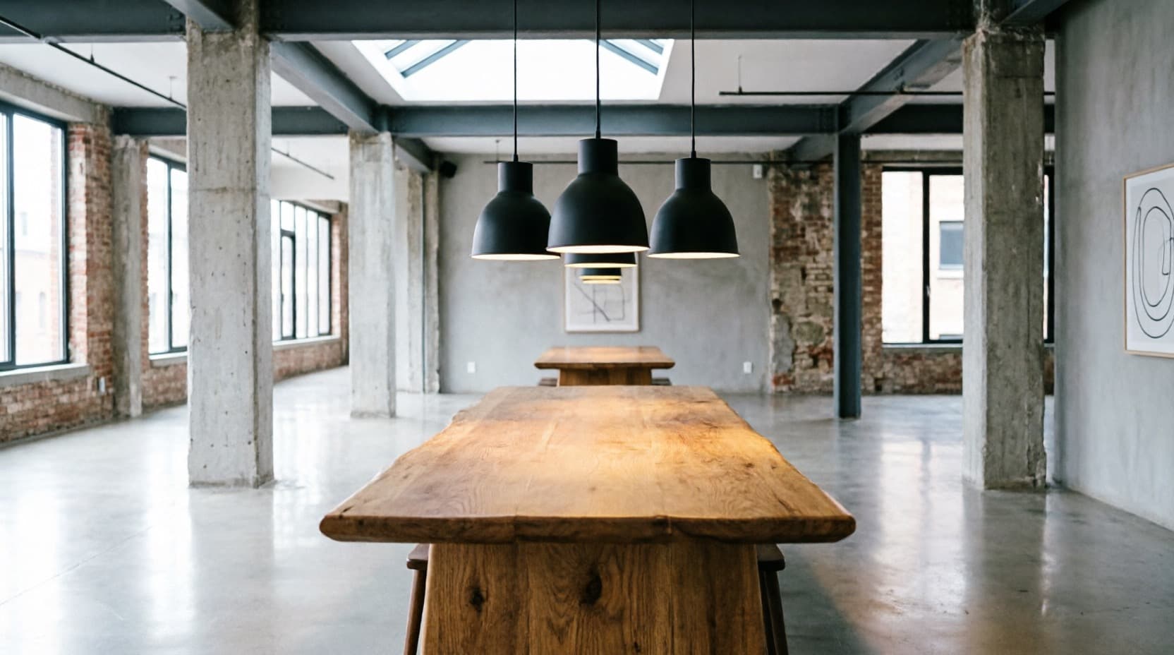
A material palette you can see
We added a horizontal swatch strip showing the studio's actual material language — walnut, sage, limewash, honed stone — something a PDF deck could describe but never really show at a glance.
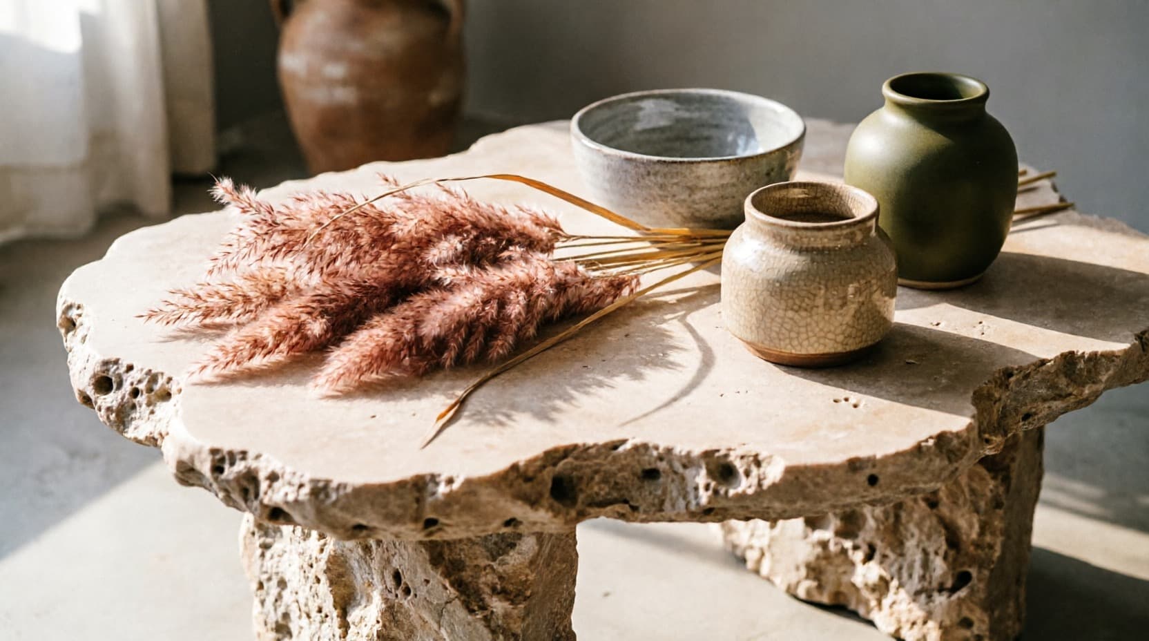
Captions on hover, not before
Project names and categories only appear when you hover a frame, keeping the grid itself purely visual — the photography does the work instead of competing with labels for attention.
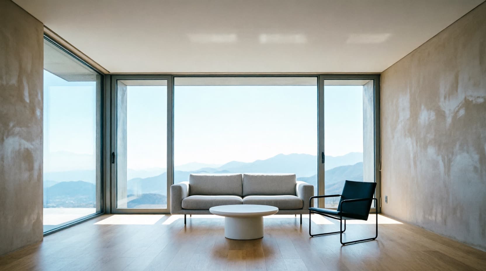
Brief to launch.
10 Days
Start to launch
Days 1–2
Discovery
Reviewed the existing PDF deck and past client walkthroughs to identify the rules the studio already designs by.
Days 3–4
Design System
Built the warm neutral palette and the material swatch strip the rest of the site runs on.
Days 5–8
Build
Built the masonry project grid, the approach section and the studio story.
Days 9–10
Review & Launch
One round of revisions, launched ahead of a feature shoot with a design publication.
What the site actually did.
Launched ahead of a feature shoot with a design publication, giving the studio somewhere real to send readers.
Qualified enquiries, first two weeks
Of visitors viewed the material palette
Average time on site
Brief to launch
How the site actually reads, top to bottom.
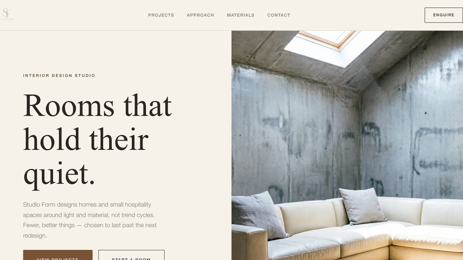
Hero
A warm neutral palette that lets the studio's own photography carry the page, instead of a template-driven look.
Gives the studio a home for the work that reads as considered as the rooms themselves.
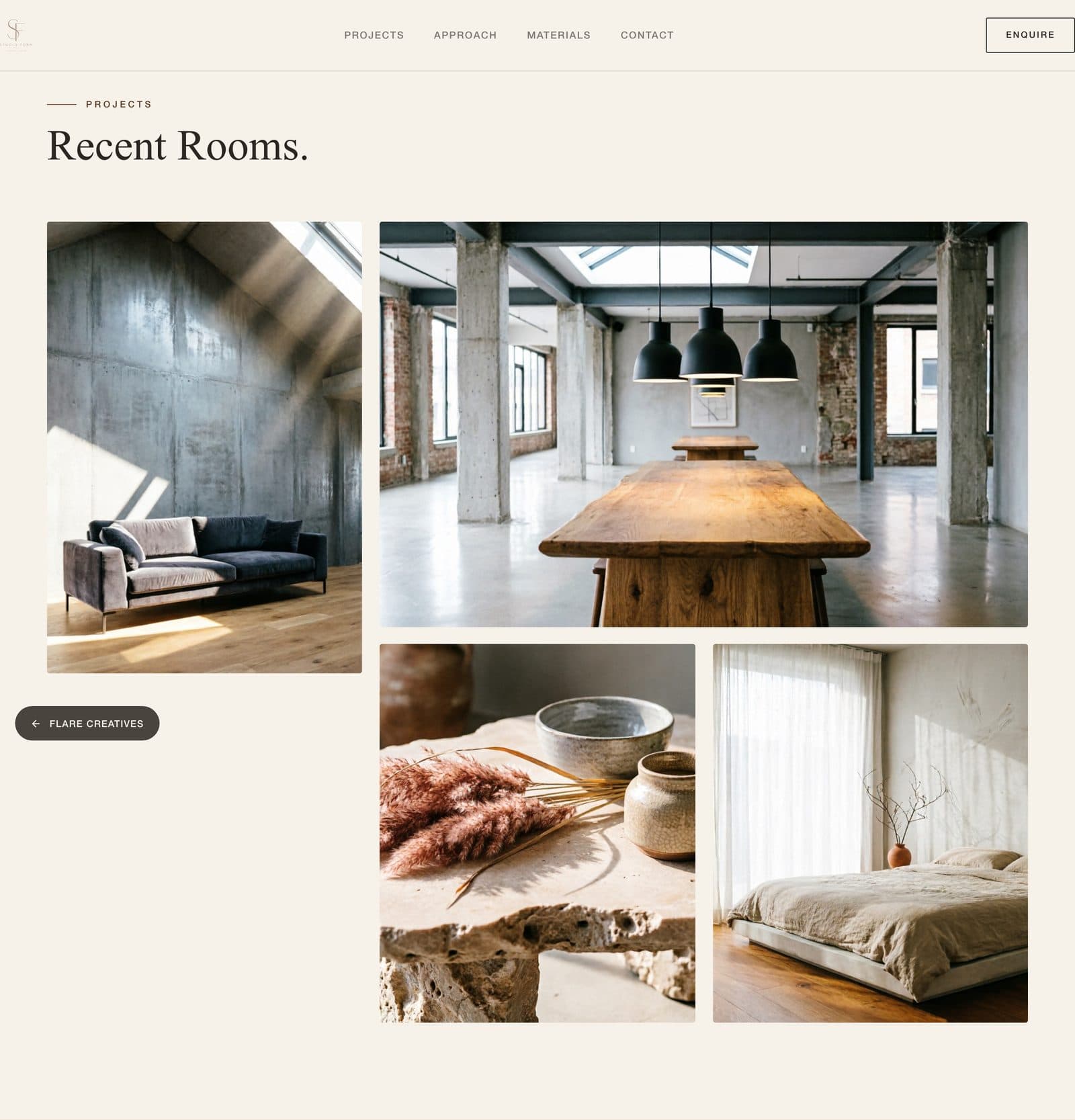
Project Index
An asymmetric masonry grid instead of a uniform slideshow — closer to how the studio actually pins up a mood board.
Replaced the PDF-deck-on-request model — 4 qualified enquiries in the first two weeks.
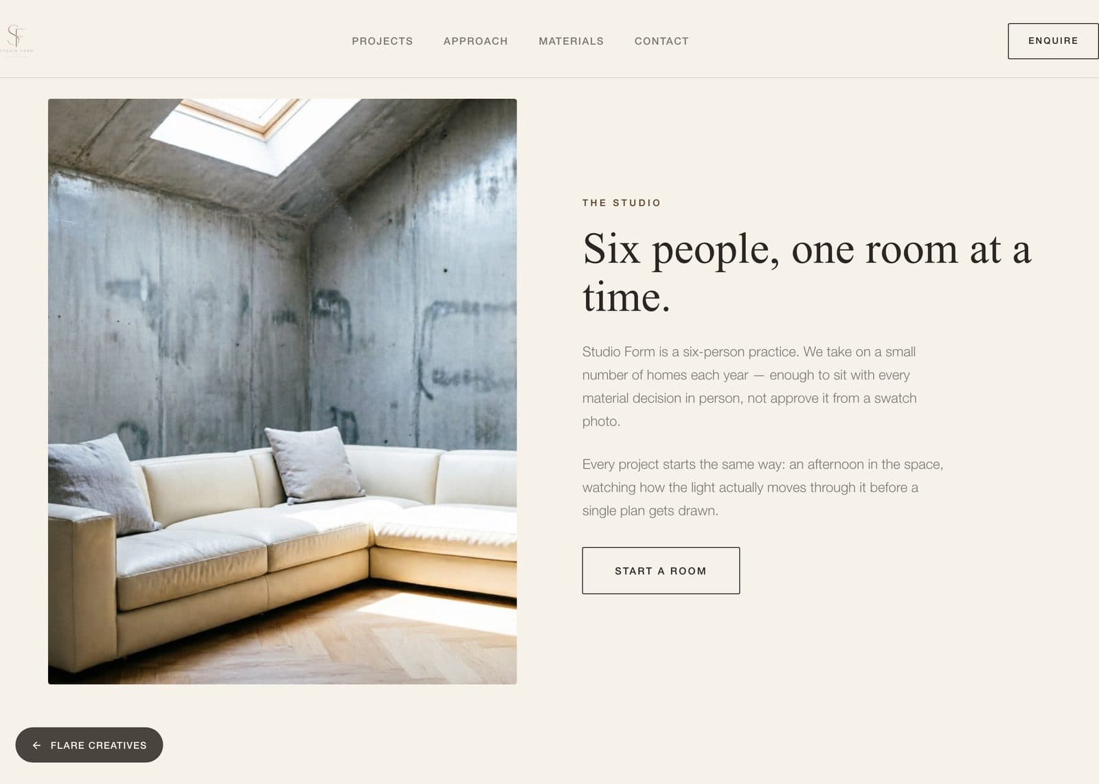
Materials
A horizontal swatch strip showing the studio's real material language — walnut, sage, limewash, honed stone.
Viewed by 66% of visitors — something a PDF deck could describe but never really show.
The systems behind the site.
Masonry project index
Replaced the PDF-deck-on-request model with a browsable project grid — driving 4 qualified enquiries in the first two weeks.
Material palette tool
A visible swatch strip of the studio's real material language, viewed by 66% of visitors.
Enquiry system
The contact flow behind the studio's first qualified leads from organic visitors, not referrals alone.