Caffenity
Client
Caffenity
Category
Coffee Brand
Timeline
18 Days
Services
Brand Identity, Web Design
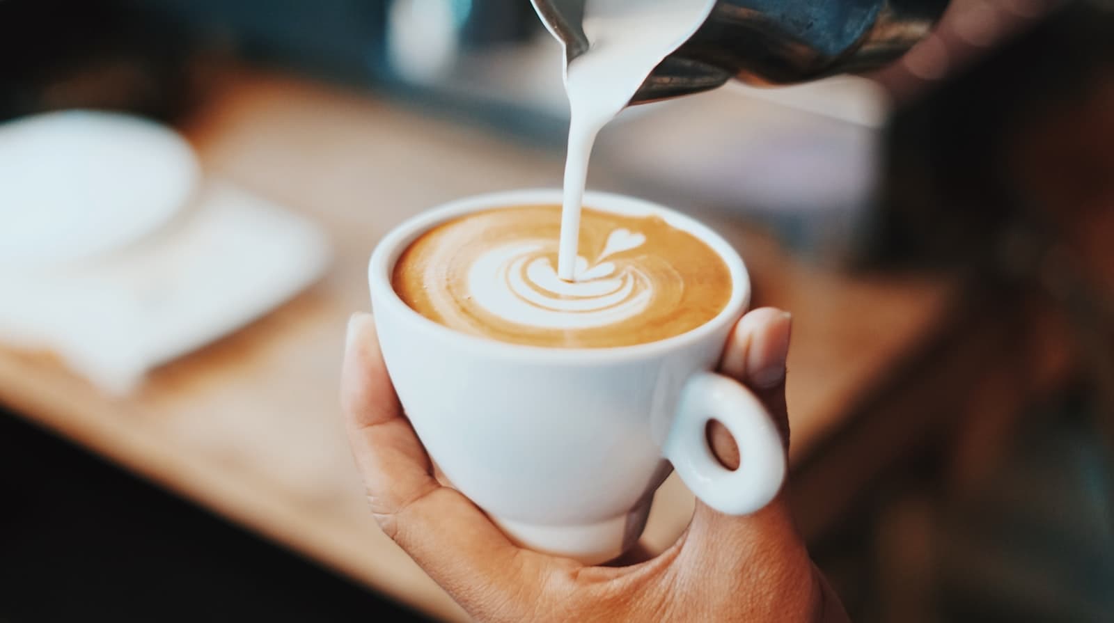
Caffenity came to us with a roaster, a name and a garage full of green beans — but nothing that could go on a bag, a sign, or a homepage. There was no logotype, no color system, nothing beyond a placeholder theme borrowed for the Instagram link in bio. The brief covered both ends at once: “we need people to trust us before they've tasted anything.”
Three decisions that shaped the brand.
A wordmark before a website
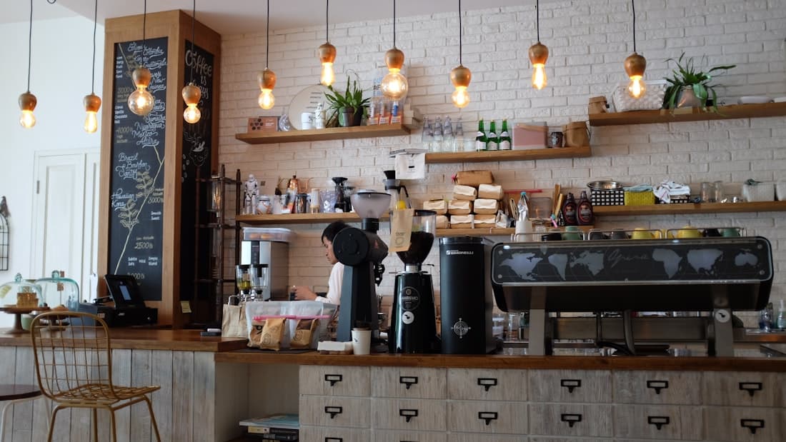
Caffenity had beans roasting and a name, but nothing to put on a bag. We built a serif C monogram with a gold-rimmed bean sitting in its counter, set the CAFFENITY logotype in Playfair Display beside it, and let that serif-and-gold system carry through every page — not a generic sans-serif placeholder standing in until 'later.'
Warm, not loud
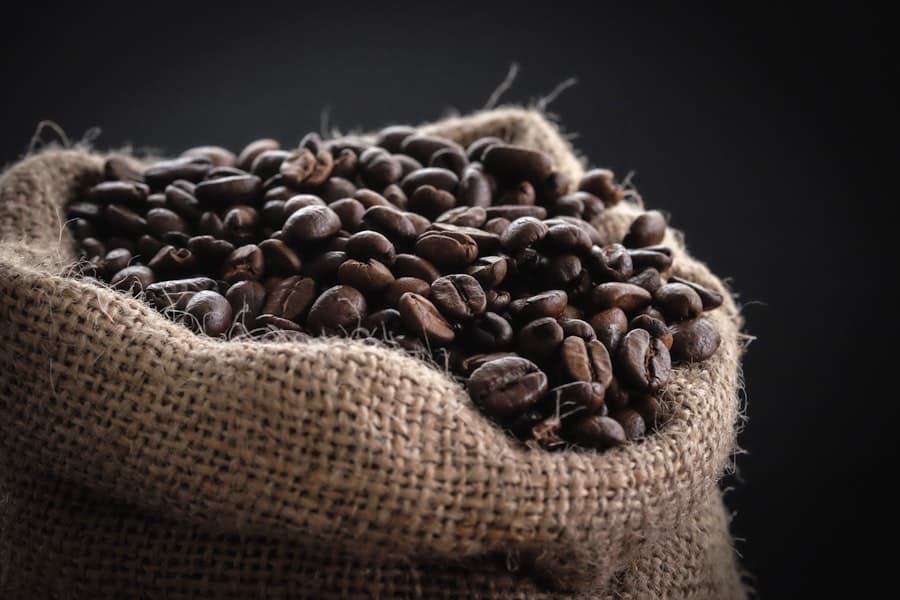
Most specialty coffee brands reach for bold red-and-black or stark minimalism. We built an ivory-and-gold palette instead — one that reads considered and small-batch, distinct from the 'bold roast' cliché every other bag on the shelf is chasing.
The pour, not the pitch
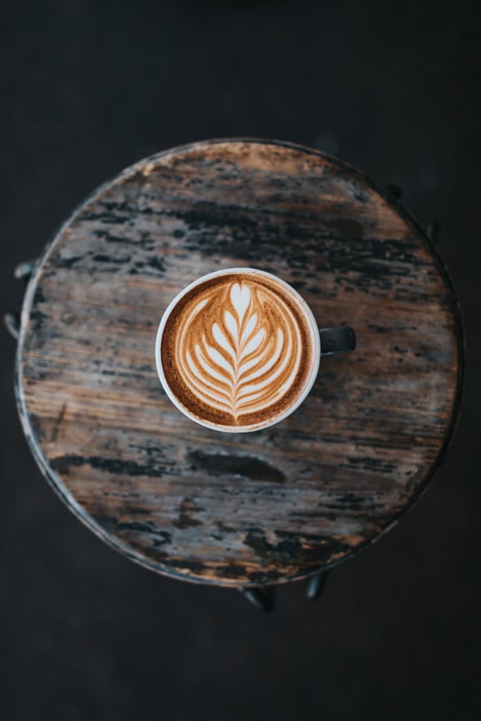
The hero puts a live pour directly beside the promise copy in a split layout, so the product is the first thing you see — not a paragraph you have to get through before any coffee shows up.
Brief to launch.
18 Days
Brand + site, start to launch
Days 1–4
Discovery & Strategy
Audited the existing roastery signage and packaging, and defined a positioning that pushed against the 'bold roast' clichés the category defaults to.
Days 5–9
Identity Design
Designed the logotype, the ivory-and-gold color system, and the Playfair/Inter type pairing — built as lockups ready for packaging, not just a website header.
Days 10–16
Web Design & Build
Built the hero, shop-by-format tiles, seasonal collections grid, heritage story, the 'As Brewed' gallery, store locator and newsletter capture.
Days 17–18
Review & Launch
Two rounds of revisions with the roastery team, launched alongside a refresh of the physical store signage.
What the brand actually did.
Launched as a complete package — identity and site went live together, alongside refreshed signage at both locations.
Roastery locations rebranded at launch
Lift in subscription sign-ups post-launch
Of site traffic from mobile
Average time on site
How the site actually reads, top to bottom.
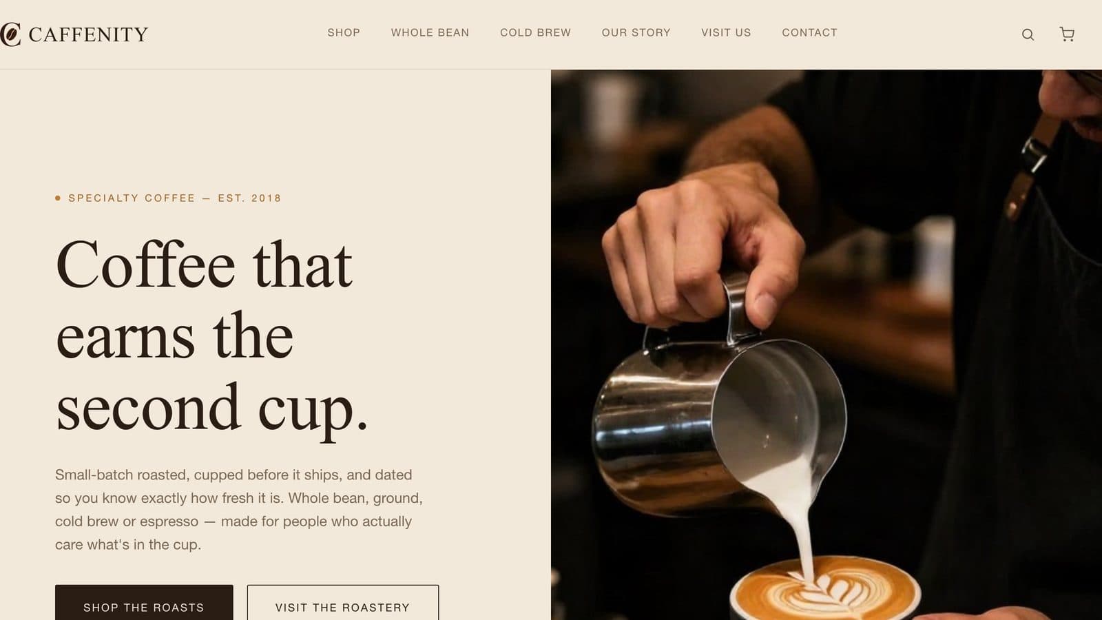
Hero
A live pour placed directly beside the promise copy, so the product is the first thing you see — not a paragraph to get through first.
The ivory-and-gold system reads considered and small-batch, distinct from the 'bold roast' cliché the category defaults to.
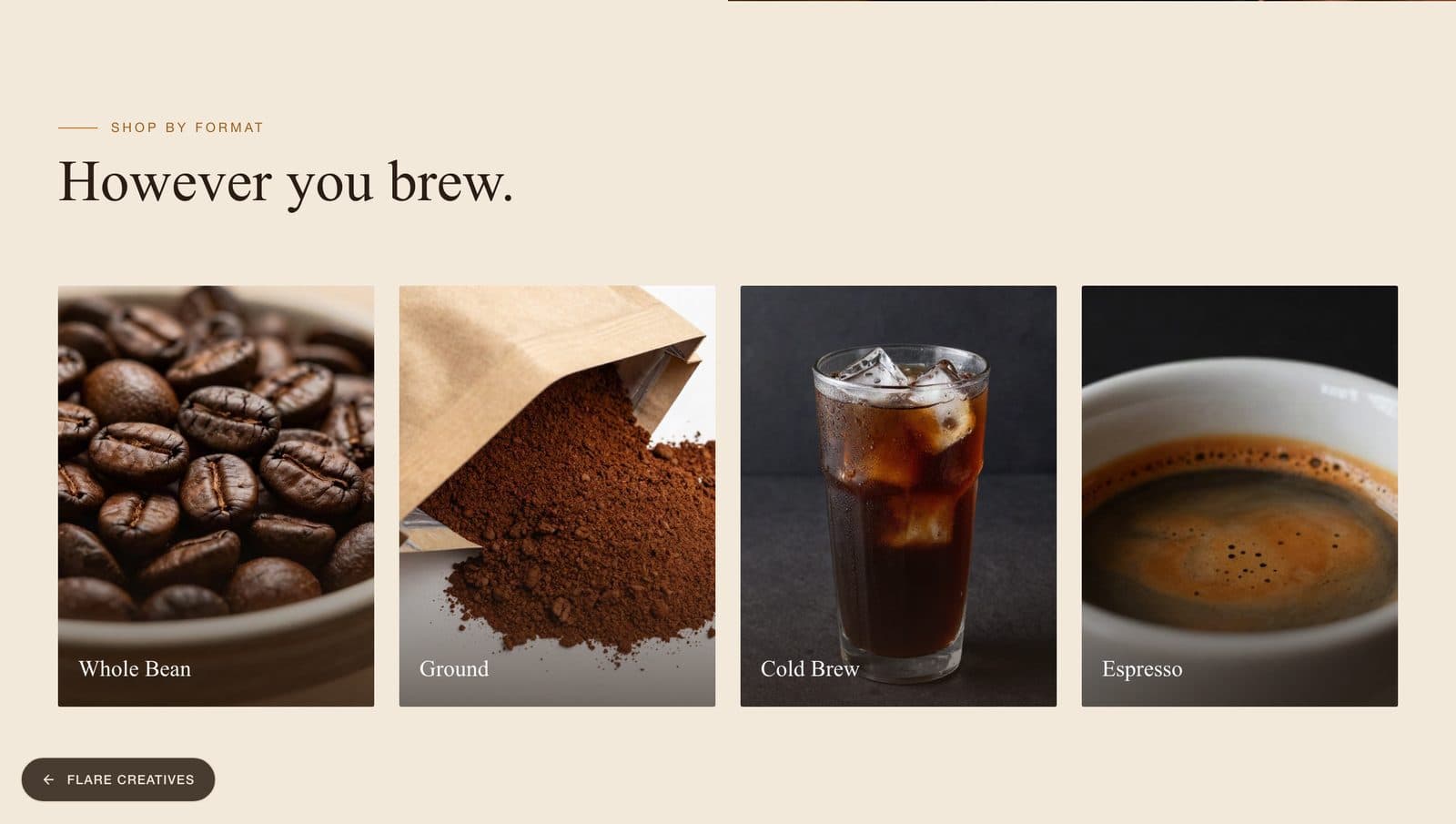
Shop by Format
Product tiles and a seasonal collections grid organizing the range by format, replacing a placeholder Instagram-linked theme.
The catalog structure behind a 34% lift in subscription sign-ups post-launch.
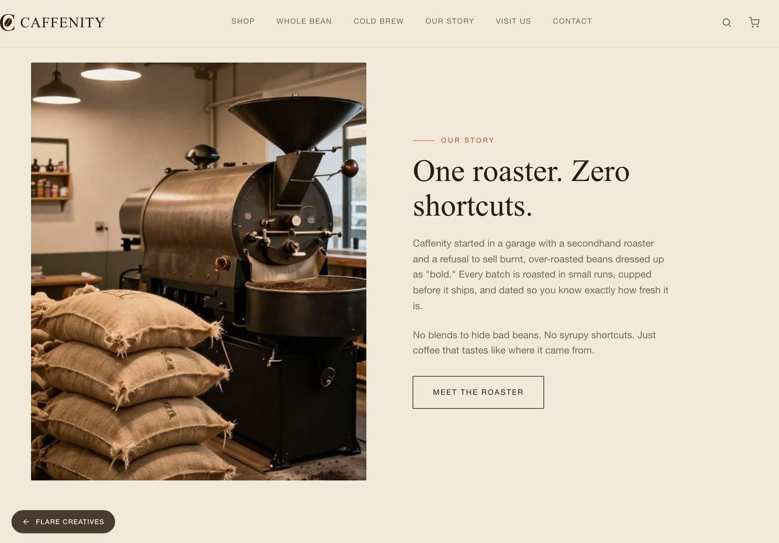
Heritage Story
The roastery's story told in full, giving the brand a reason to trust it before anyone's tasted the coffee.
Backs the identity across both physical roastery locations, not just the site.
The systems behind the site.
Shop-by-format catalog
Product tiles and a seasonal collections grid, built to organize the roastery's range by format rather than a flat product list.
Store locator
A locator connecting the site to both physical roastery locations.
Newsletter & subscription capture
The signup flow behind the 34% lift in subscription sign-ups after launch.