Gym & Tonic
Client
Gym & Tonic
Category
Fitness Brand
Timeline
15 Days
Services
Web Design, Art Direction

Gym & Tonic came to us three months before opening, with a waitlist running entirely on Instagram DMs and a founder who kept describing the club in the same four words: strength, conditioning, recovery, mobility. They didn't want a typical bright, mirror-selfie gym site — they wanted something that read as considered as the membership cap itself. The brief was blunt: “make it feel like you can't just walk in.”
Three decisions that shaped the site.
A duotone system, not a bright one
Most boutique gym sites lean bright and crowded — sunlit floors, big smiling groups. We went black and acid-lime instead, running every photograph through the same duotone treatment, because a members-capped club should look considered, not open to everyone.

A floor plan, not a feature grid
Instead of a four-icon amenities grid, the 'Method' became a numbered list that mirrors how the founders actually pitch the club in person, and the five training rooms became a horizontal filmstrip you scroll through — closer to walking the floor than browsing a catalogue.

Coached, not counted
Trainer bios run as an editorial list — a name, a specialty, and a circular photo that zooms on hover — instead of a wall of headshot cards. It reads like a small coached roster, which is what the club actually is, not a generic staff directory.

Brief to soft-launch.
15 Days
Start to soft-launch
Days 1–3
Discovery
Audited the Instagram waitlist messaging and founder interviews; landed on the four pillars — Load, Recover, Refuel, Repeat — that became the site's spine.
Days 4–7
Design System
Built the black/acid-lime duotone system and paired condensed display type with an italic serif — deliberately distinct from the pastel wellness look most boutique gyms default to.
Days 8–13
Build
Built the marquee, the room filmstrip, the trainer rows and the count-up stat band, then wired the founding-membership enquiry form.
Days 14–15
Review & Soft Launch
Two rounds of revisions with the founders, copy tightened line by line, soft-launched to the existing waitlist.
What the site actually did.
Soft-launched privately to the existing waitlist before the club's doors opened.
Founding memberships, capped
To fill the founding cohort
Of enquiries came from mobile
Average time on site
How the site actually reads, top to bottom.
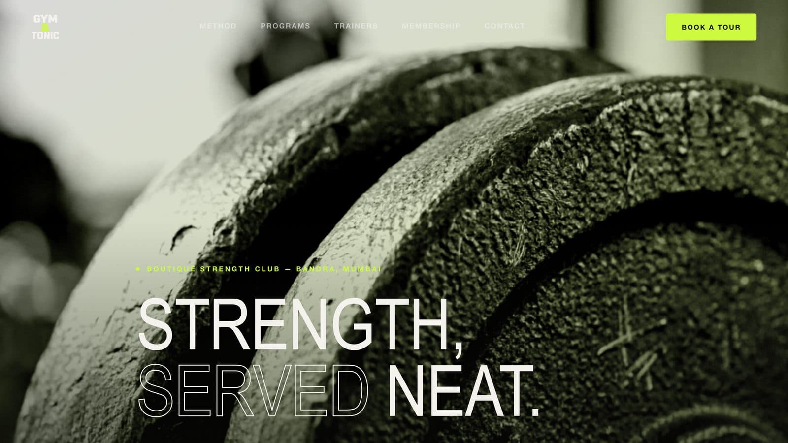
Hero
Black and acid-lime duotone applied to every photograph, instead of the bright, crowded look most boutique gym sites default to.
Reads considered and selective from the first screen, matching the capped-membership model.
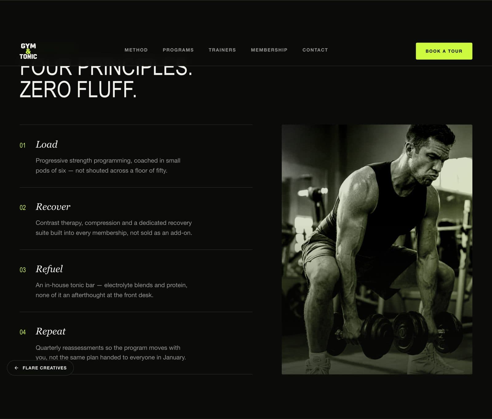
Method
The four pillars — Load, Recover, Refuel, Repeat — as a numbered list mirroring how the founders actually pitch the club in person.
Turns the founders' verbal pitch into a structure visitors can scan in seconds.
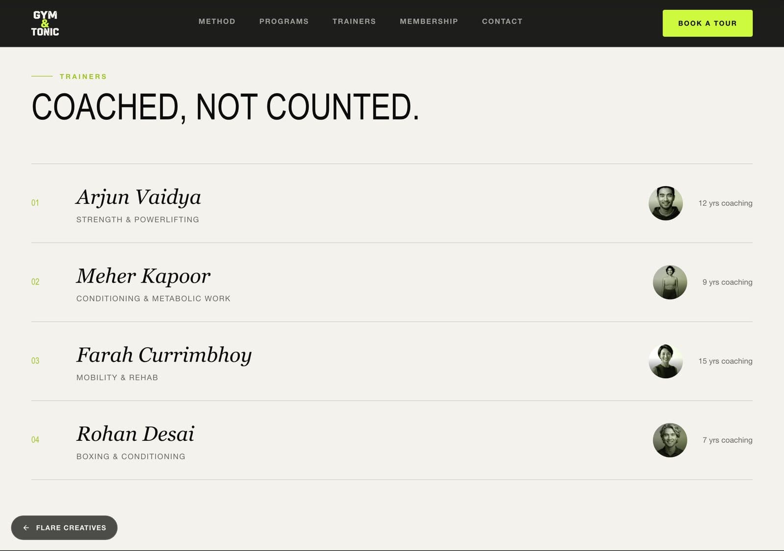
Trainers
An editorial trainer list — name, specialty, a photo that zooms on hover — instead of a wall of generic headshot cards.
Reads like a small coached roster, which is what the club actually is.
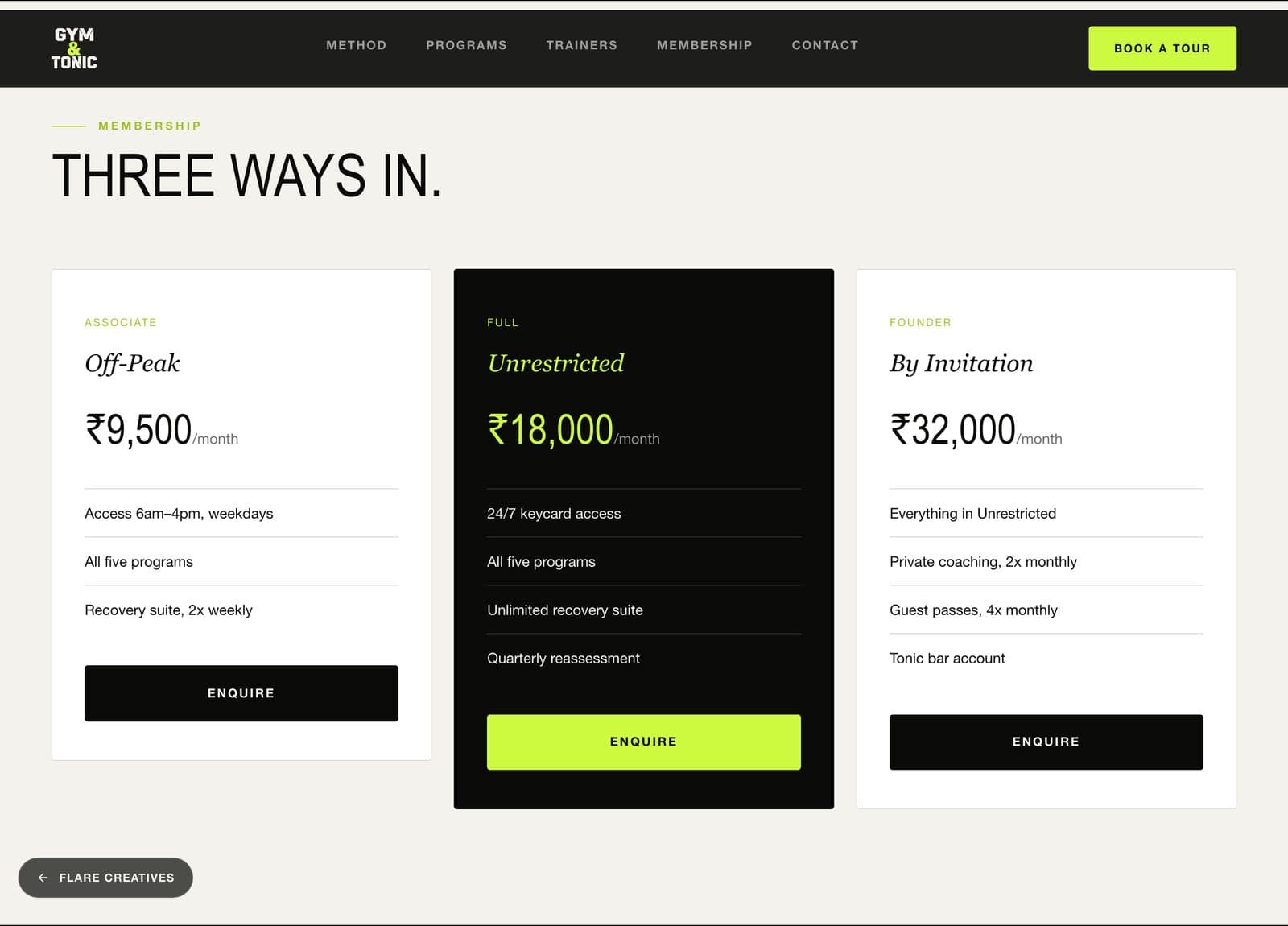
Founding Membership
A founding-membership enquiry form replacing an Instagram DM waitlist, built mobile-first since most enquiries come from phones.
Filled all 400 capped founding memberships in 3 weeks, with 61% of enquiries from mobile.
The systems behind the site.
Founding-membership enquiry system
The waitlist-to-enquiry flow that filled all 400 capped founding memberships in 3 weeks, replacing an Instagram DM waitlist.
Mobile-first enquiry flow
Built and tested for mobile first — 61% of enquiries came through on mobile.
Trainer roster system
An editorial trainer-profile layout built to read as a small coached roster, not a generic staff directory.