Maison Dorée
Client
Maison Dorée
Category
Restaurant
Timeline
14 Days
Services
Web Design, Art Direction
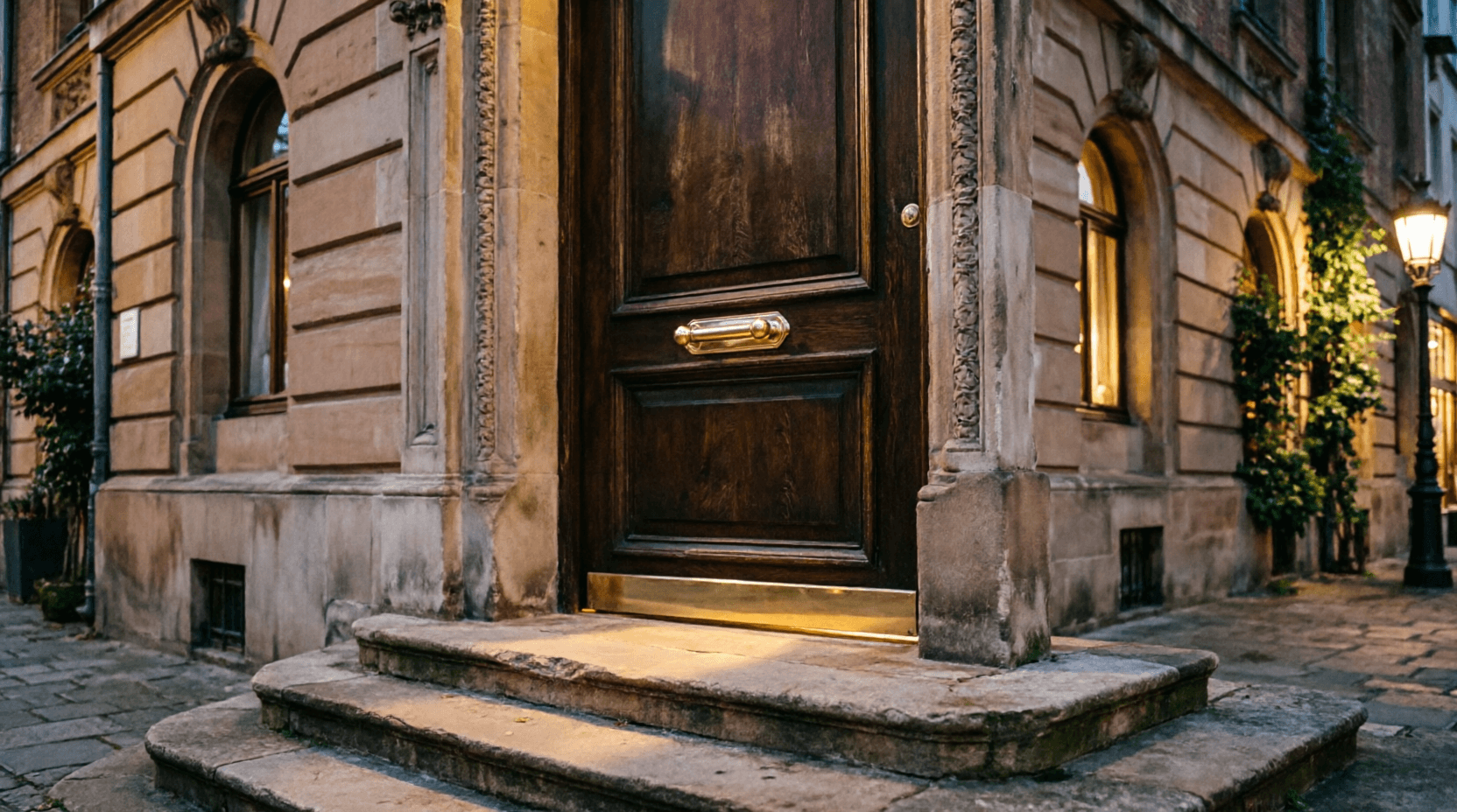
Maison Dorée had built a genuine following on an open-flame tasting menu and a cellar the sommelier had spent ten years assembling — and a website that showed neither. Reservations ran through a phone line that went to voicemail after 6pm, exactly when most guests were trying to book. This restaurant website design brief was direct: “make the site as considered as the menu.”
Three decisions that shaped the site.
Dark, not moody-for-the-sake-of-it
Fine-dining sites default to bright, white-tablecloth photography that could belong to any restaurant. We went the other way — a near-black charcoal base with a single warm ember accent, so every photo of the hearth and the candlelit room reads as the actual identity, not a stock filter over the top.
The menu as the site's spine
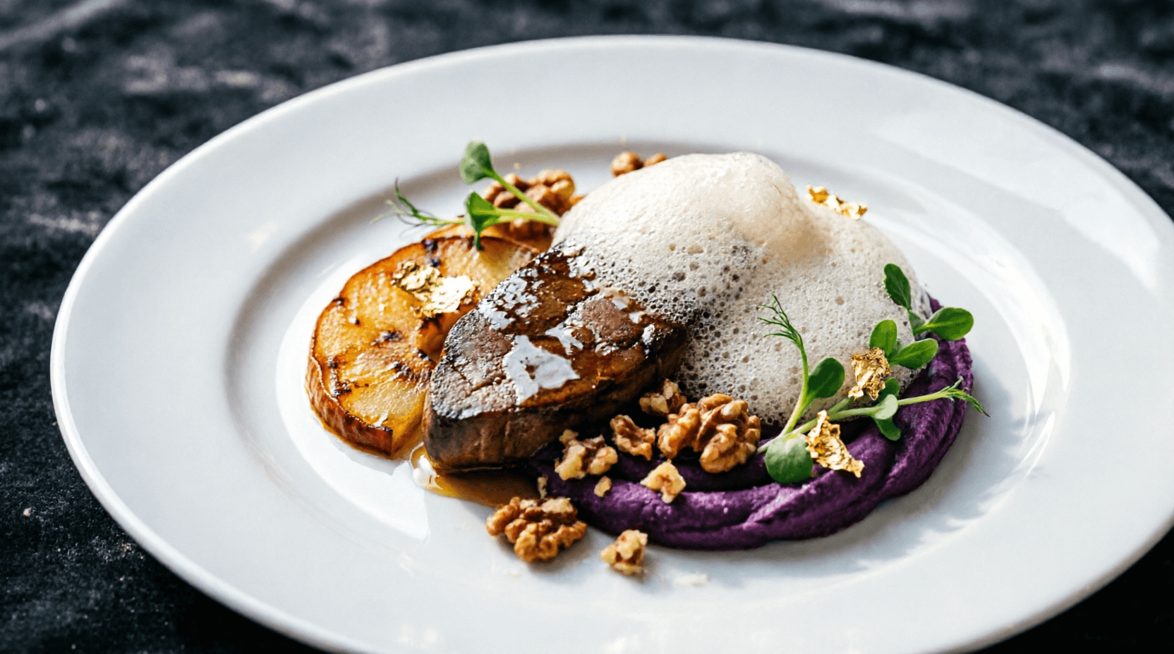
Instead of burying the eight-course tasting menu behind a PDF download, it became a numbered list running the length of the page — the same order the kitchen actually plates it in, with each course given room to breathe rather than crammed into a sidebar.
A cellar built over ten years, shown as a fact
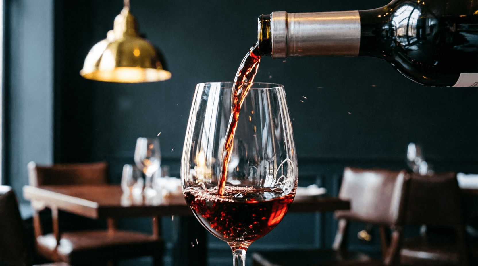
The sommelier's cellar was the restaurant's best-kept secret — mentioned in reviews but invisible on the old site. We gave it its own section with hard numbers (1,200+ bottles, a decade building the list) instead of vague 'curated wine list' copy.
Brief to launch.
14 Days
Start to launch
Days 1–2
Discovery
Shot list review with the chef and sommelier; landed on live-fire cooking and the ten-year cellar as the two things no competitor could copy.
Days 3–5
Design System
Built the charcoal-and-ember palette and paired an italic serif display face with a plain sans body — deliberately warmer than the stark black-and-white look most tasting-menu sites lean on.
Days 6–11
Build
Built the hero, the eight-course menu grid, the room gallery and the cellar section, then wired the reservation request form to replace the after-hours voicemail.
Days 12–14
Review & Launch
One round of copy revisions with the chef, menu pricing double-checked against the actual card, launched ahead of a weekend service.
What the site actually did.
Launched ahead of a weekend service, with the reservation form replacing the after-hours voicemail.
Of reservation requests now made online
Increase in weeknight bookings
Average time on the menu section
Missed reservation calls after launch
How the site actually reads, top to bottom.
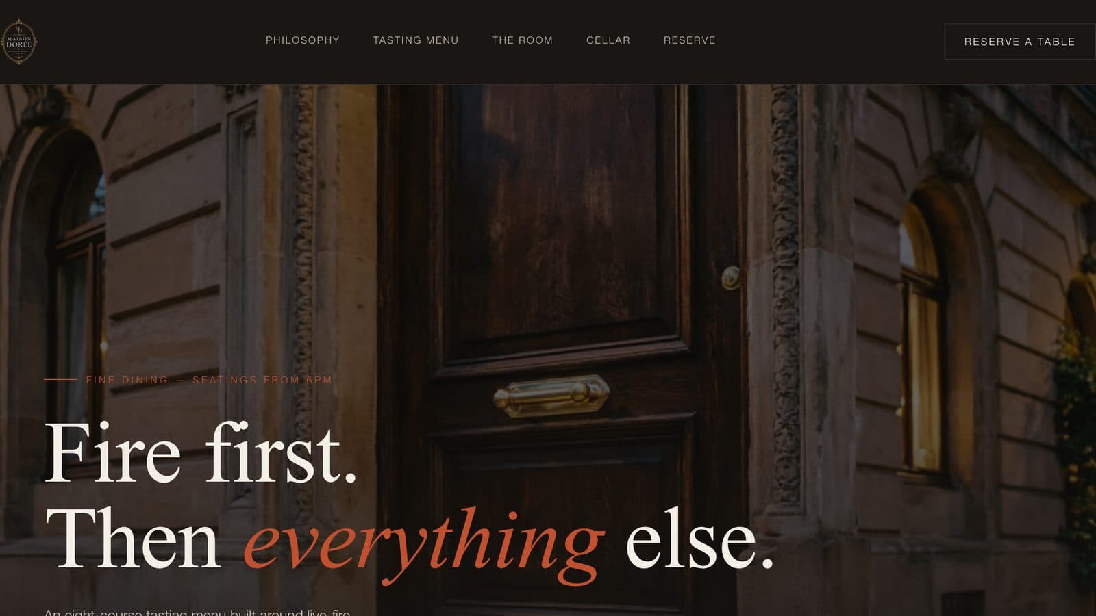
Hero — "Fire first. Then everything else."
A near-black charcoal base instead of the bright white-tablecloth photography most fine-dining sites default to — so the live-fire identity reads immediately, not after three scrolls.
Sets the reservation-first, considered tone the moment the page loads.
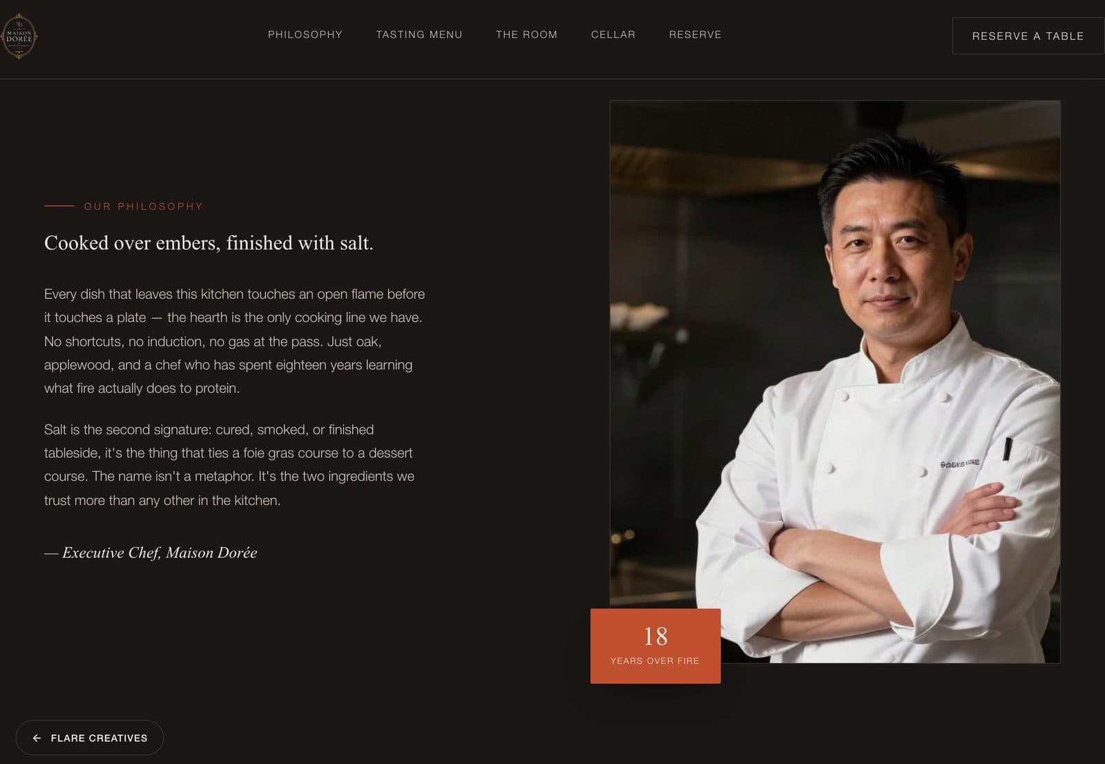
Philosophy
States the live-fire cooking and ten-year cellar up front — the two things the chef and sommelier agreed no competitor could copy.
Establishes the restaurant's actual point of difference before a visitor ever sees the menu.
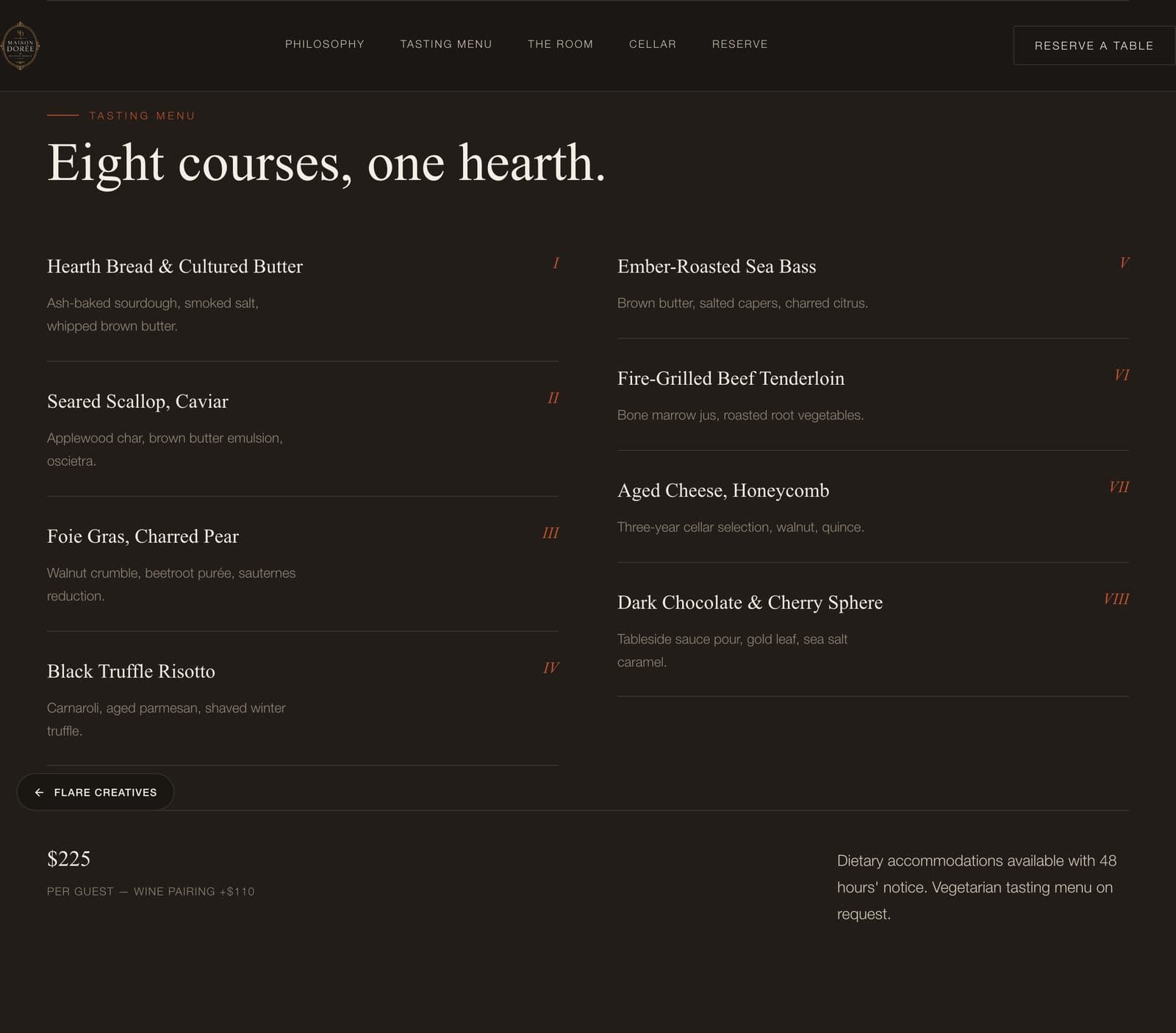
Tasting Menu
The eight-course menu as a numbered list in the kitchen's real plating order, replacing a PDF download.
The single most-engaged section on the site — 4.9 minutes average time spent here.
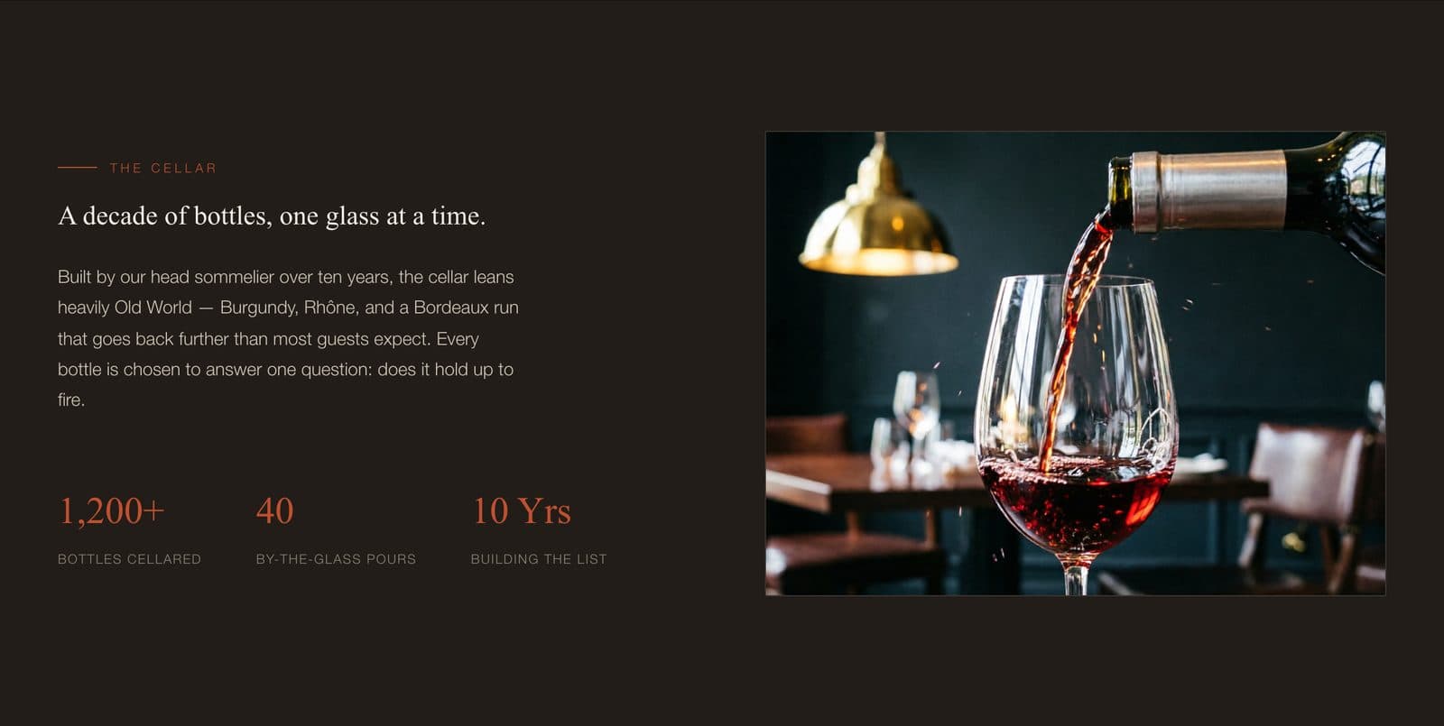
Cellar
A dedicated section with hard numbers — 1,200+ bottles, a decade building the list — instead of vague 'curated wine list' copy.
Surfaces a detail that was previously mentioned only in reviews, invisible on the old site.
The systems behind the site.
Online reservation system
Replaced an after-6pm voicemail line — 73% of reservation requests are now made online, with zero missed calls after launch.
Dynamic course-menu grid
The eight-course tasting menu presented in the kitchen's actual plating order, not a static PDF.
Cellar & wine-list system
A dedicated section surfacing the sommelier's 1,200+ bottle cellar, previously invisible on the old site.